By Imane Ahammar.
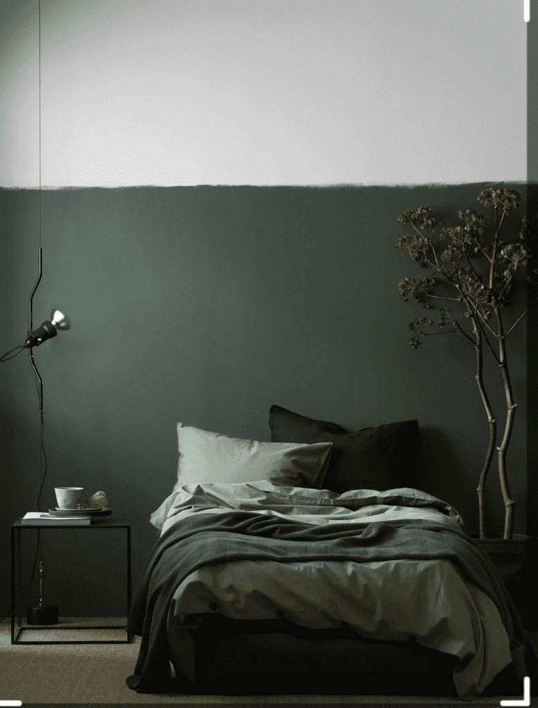
It’s so good to have you back girl! Remember when last week I told you that I wanted to talk about so many topics? Well I got some exciting news for you because today I am going to talk about one of my favorite topics within interior; COLOR. I mean doesn’t color add brightness into our lives and everyone secretly has a favorite color that they adore. So, this time I am going to take you through a ride of colors and what they can actual do for us within our spaces.
I know you remember me also telling you that the first step to styling or decorating your interior was to focus on the feeling you want each room to vibrate, and this is very relatable towards color in our spaces too. In the interior world definitions such as color palette and schemes are very common and almost every interior designer takes a good look at which schemes, combinations of multiple colors within the same family, suit your lifestyle and wishes. Today I will teach a few new things so that you can understand why color schemes are very important and which ones are currently on trend if you’re in search of a trendy scheme for your own interior or want to refresh your living room or any other desired space.
I will start at the base so that I can take you into depth of what color actually does to us as individual people. For this a theory called color psychology will be involved. Color psychology has been used for over two centuries now, originally studied and defined by Johann Wolfgang von Goethe. You might have heard of this name before – Goethe being one of world’s famous German poet and artist. Goethe believed in the fact that colors could stimulate emotions within our brains and that each color have different meanings. In his book Theory of Colors, he explicitly explains the color theory in detail. Years later even, Swiss psychiatrist and psychoanalyst Carl Jung, decided to follow up the theory of colors and until this day we are still using the color theory in many fields all over the world.
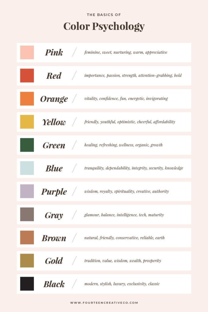
For the interior design world color psychology is therefore one of the most important aspects to look at as an interior designer. While colors are being used to radiate certain ambiences that will initially have an effect on our moods and create emotional responses, it is supreme to understand how you experience a room when being there.
It’s also one of the first things to look at as it spreads out both the visual message as well as the psychological one when you’re taking your first step into a room.
So, what color palettes are there? I mean there are hundreds of color schemes that I can take you through, but I will guide you through the most common and trendy ones of this year – with some attention on warm neutrals and a pop of color as they were on top of the game – defined as timeless, meaning you can never go wrong with them! I will start off with the green color palette as it was this year’s most favorable and trendy color scheme used within various interior spaces. The color green with all of its shades and undertones have become a true interior statement. For most of all, when using green colors you will be able to bring the feeling of nature very close to you even if you are far away from one of your favorite landscapes. Freshness and healing are also characteristics of the green color schemes, so if you’re looking for exactly this feeling than you know what to do girl!
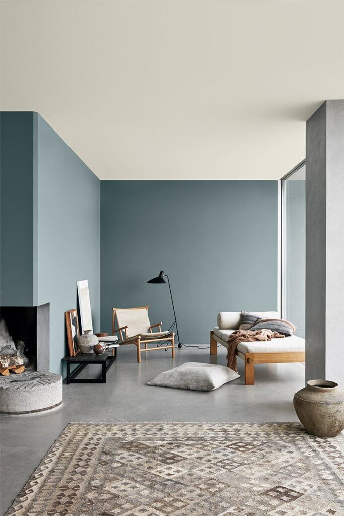
Next to green, the blue color scheme was also on top of the most trendy color palettes in 2022. Terms such as inspiration, relaxation, intelligence, serenity and loyalty are exactly what blue tones manifest. At the same time, just like green does, blue undertones can also bring you back to the nature. Think about the sea for example, a warm blue tone and mix it with some white and beige – which give off the feeling of a clean, adaptable and fresh room. And there you have it, you may be far from the beach but it’s so easy to incorporate color like these into your home to get the ultimate beachy feeling.
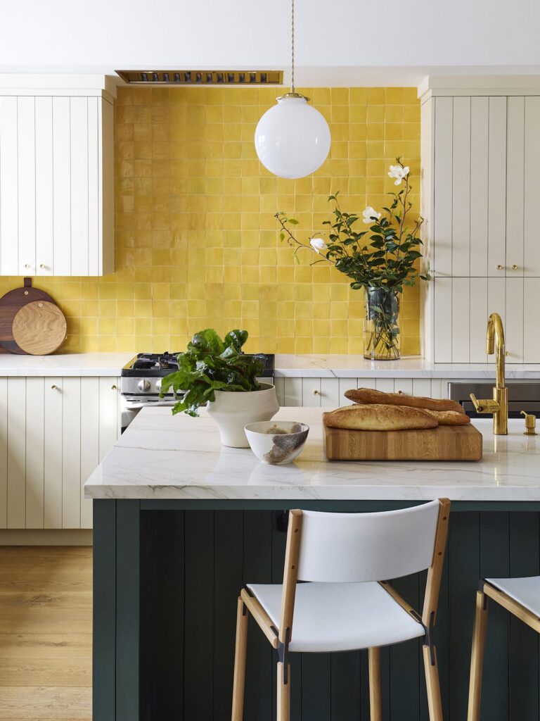
And just like blue, brown tones express earth, warmth and tranquility. And if you want to go for something which will hint towards a more neutral, comfortable, versatile yet at the same time express happiness, optimism and cheerfulness you can go for a subtle yellow – which is the perfect pop of color in your space!
Other warm pops of color such as pink and purple give more of a classic, maturing, romantic, calming, spiritual and comforting feel to the space.
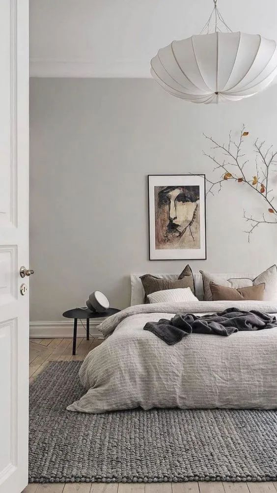
There is also many nonchalant tones which can give a more cool look to a room. Greige was another one of this year’s trendiest color palettes too, the perfect mix between grey and beige, soft and stylish at the same time. Perfect for literally every season and so timeless.
If choosing just one of these trendy color scheme for each room becomes difficult I advise you to use some other color schemes throughout the decoration of your room. This way you will have a cool toned background with pops of color here and there.
It also doesn’t stop here, every year we discover new color palettes, new trends that we can hop on so we can spice up our spaces. So when you feel like you have had a color for quite a while and you want to change the colors, you can easily search for the latest color trends by Benjamin Moore or Sherwin Williams and see what sparks your interest!
So, now that you’re aware of how important color actually is within interior I am sure you can go on and create or use that perfect color palette for you! Because I am not going to tell you how to do it, YOU have to do it because you CAN!
Aren’t you just going to look at colors differently now especially when you know what feelings they can stimulate and how much they can influence your own home? I am so ready to see your space shine!!
And if this isn’t enough than wait for me in my next interior article where we will not be focusing on our inside spaces but this time our outside spaces, because they need some attention and loving too as they are just as important for our lifestyle and health.
Speak to you very soon!


